Xcel Hardware
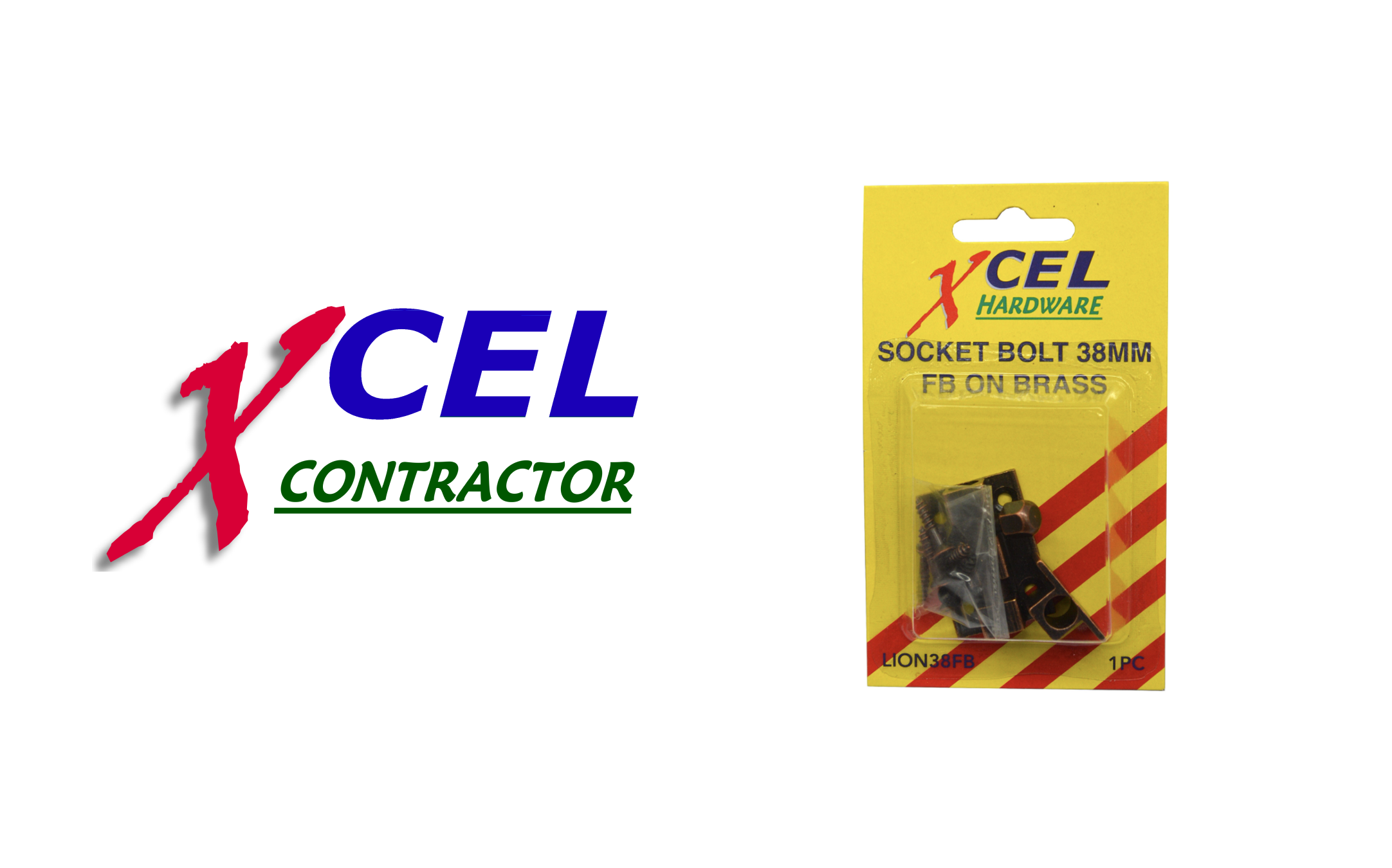
A brand refresh for Xcel Hardware, a value-focused product brand sold through hardware retailers. With a range spanning everything from screws and fixings to door handles and other larger hardware products, the existing brand had become severely outdated and lacked any consistent visual system across the range.
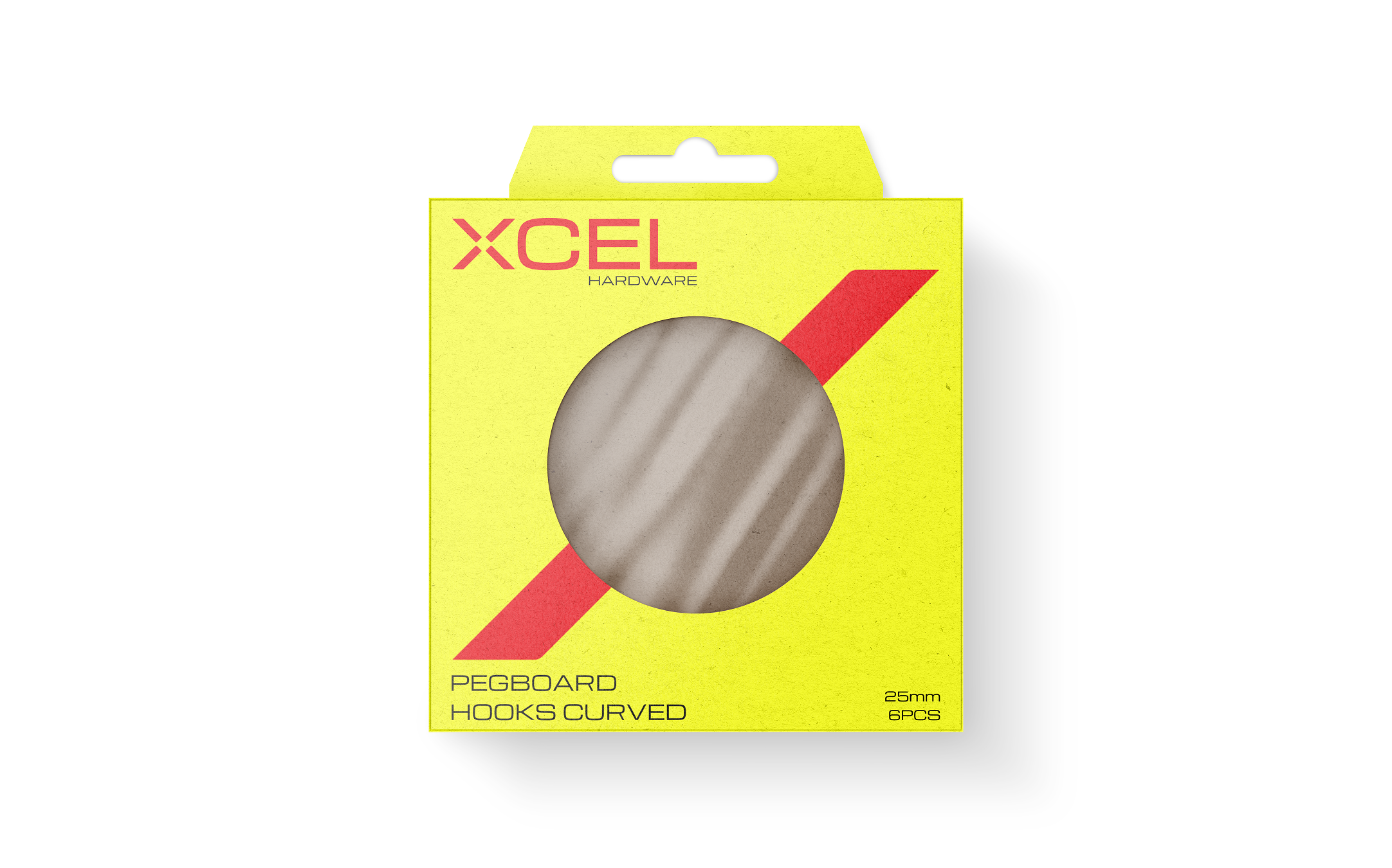
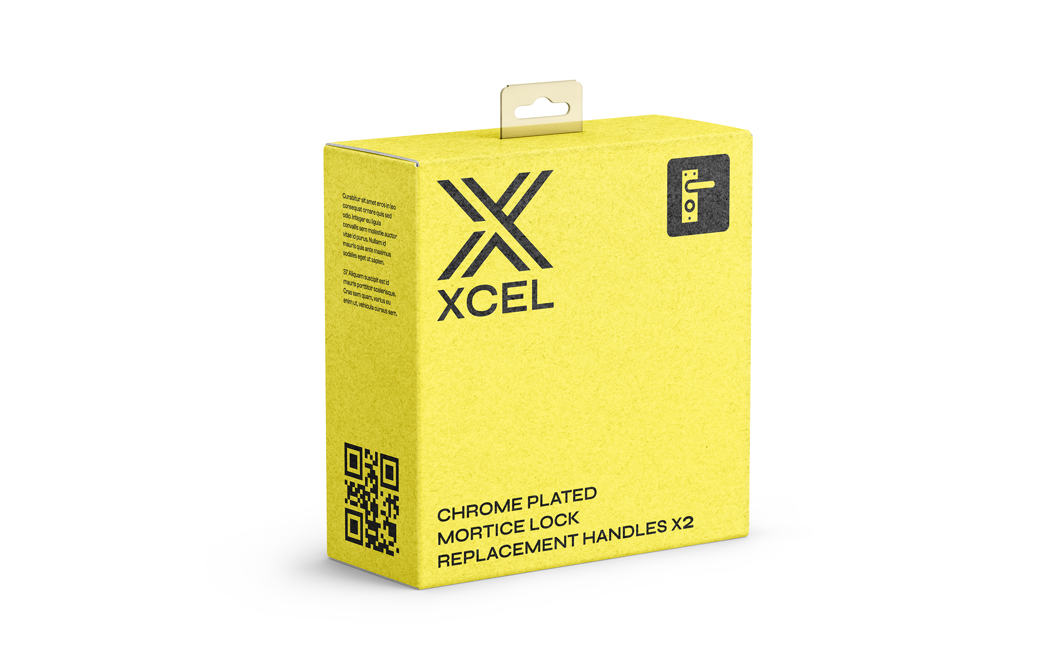
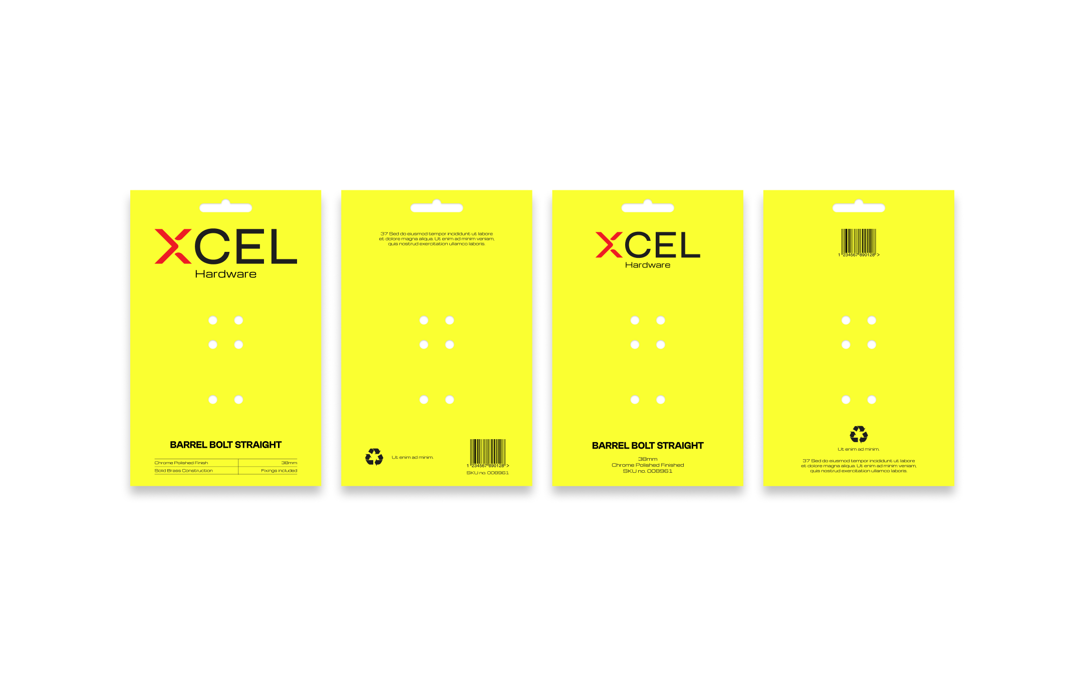
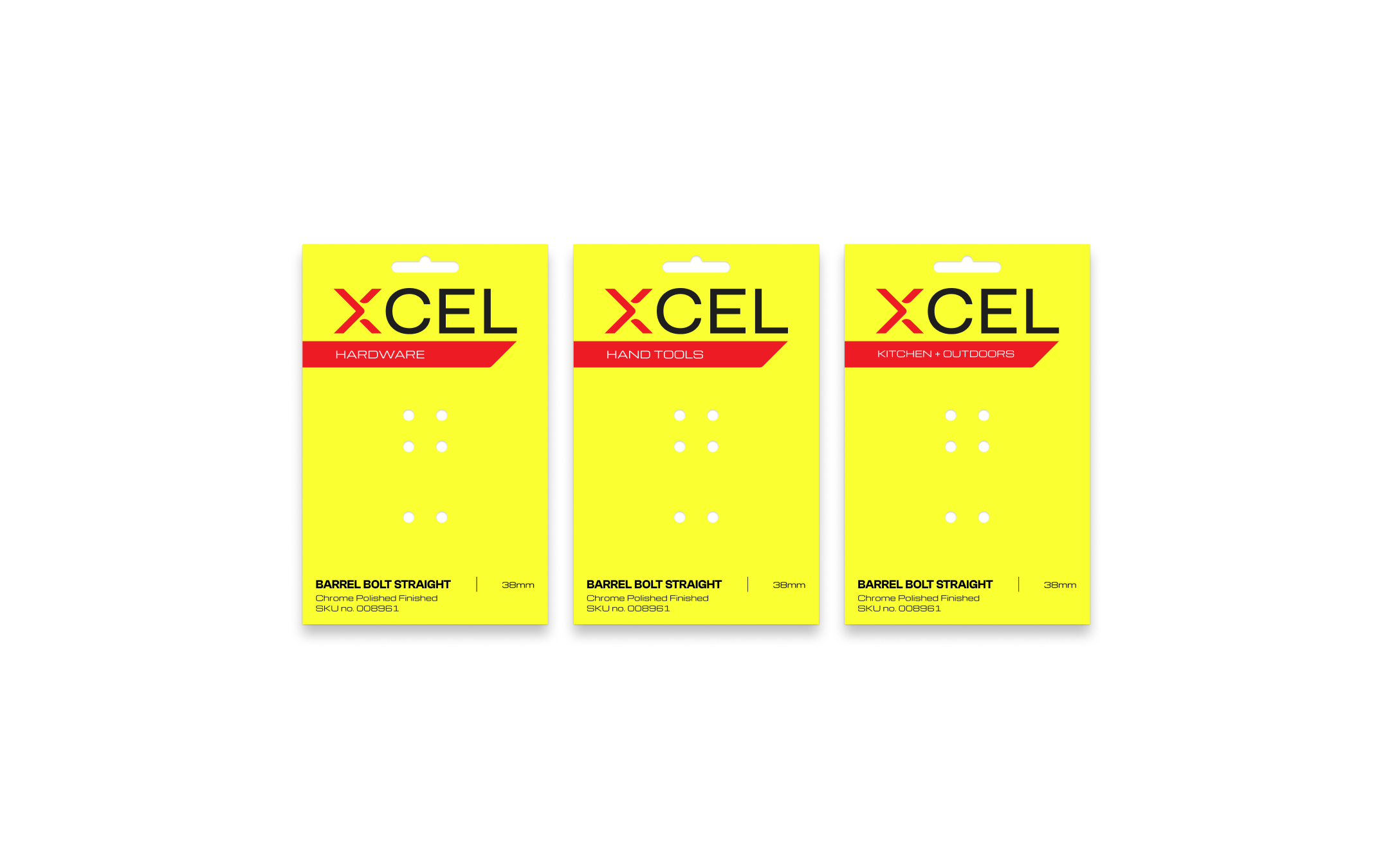
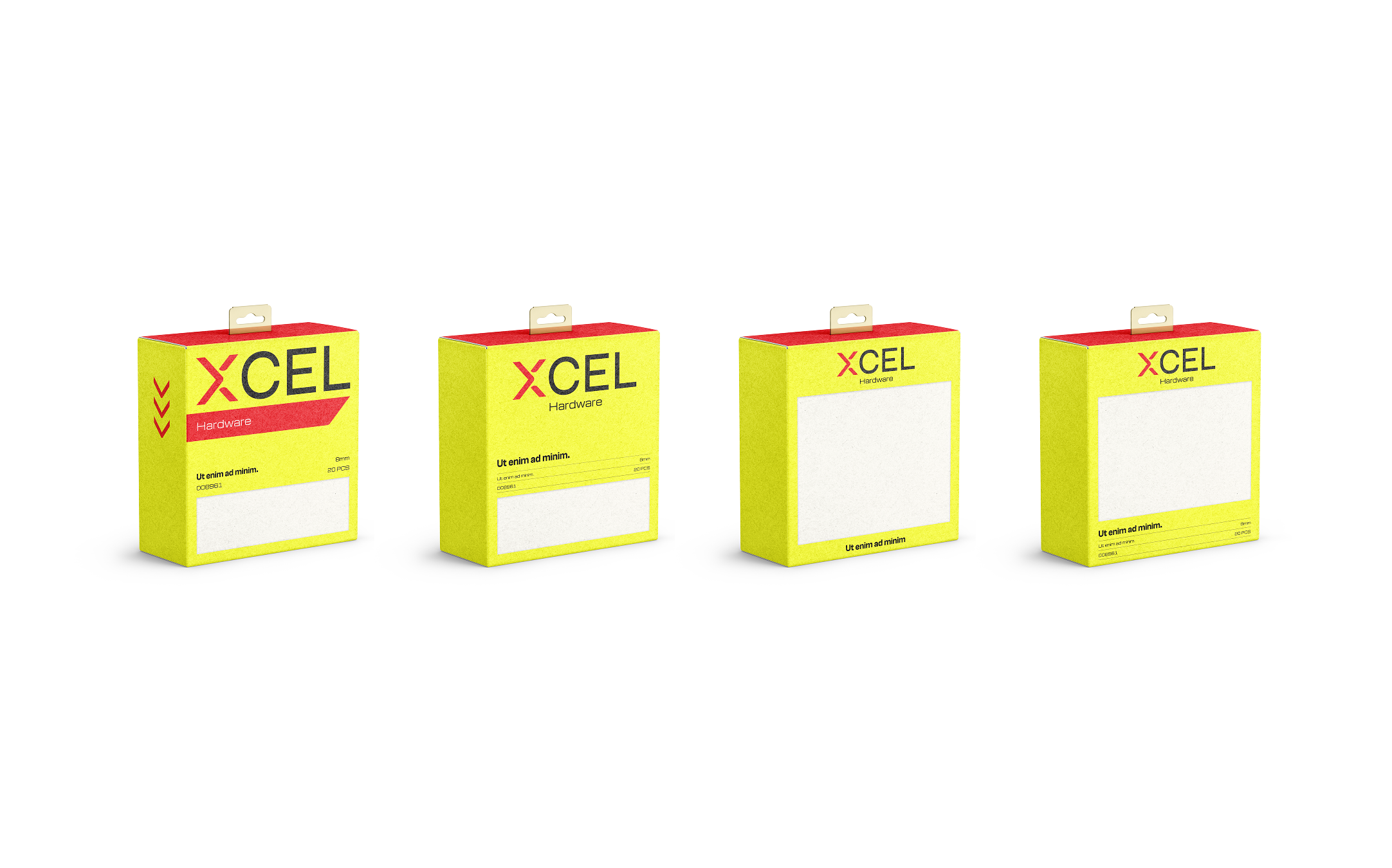
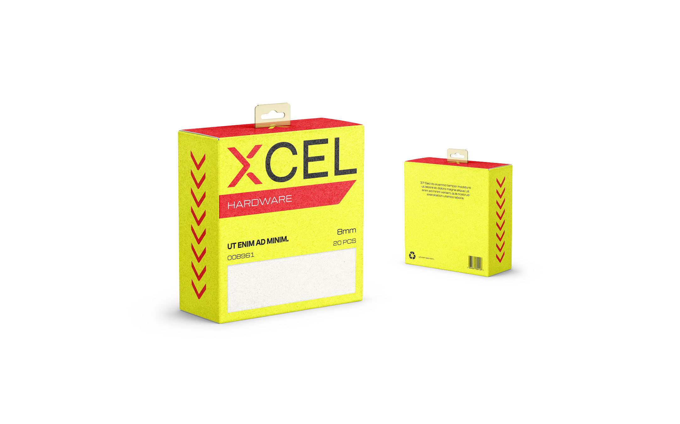
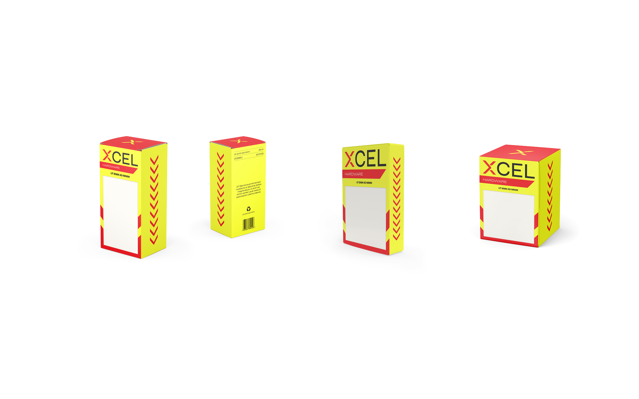
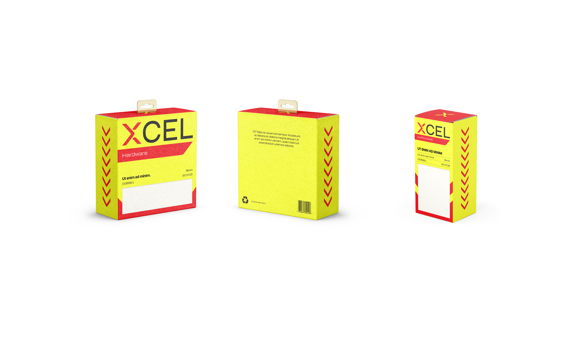
Packaging varied significantly from product to product, with inconsistencies across colour, typography, layout and overall presentation. The challenge was to create a more cohesive identity that could work across a broad and varied product range, while still communicating the brand’s core promise of accessible, value-priced hardware.
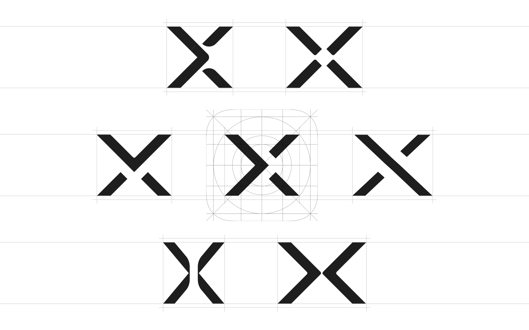
The creative direction was deliberately restrained. Inspiration came directly from the tools and objects associated with the products themselves, particularly the precision of measurement and fitting tools used to get things accurately into place. This also tied into the idea of Xcel being the missing piece that helps you complete those everyday DIY jobs around the home.
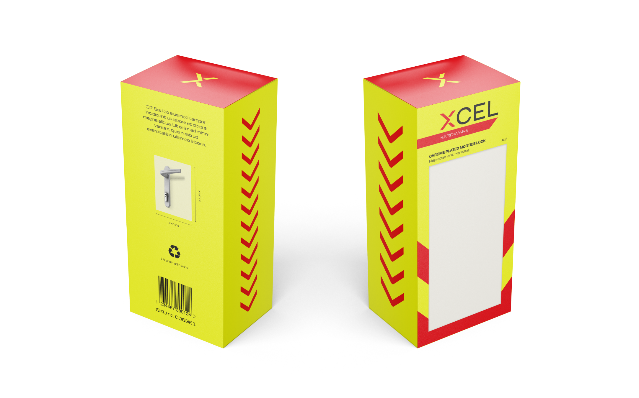
This thinking informed a simple, functional visual language that feels practical and purposeful. Rather than competing with the visual noise commonly found across hardware shelves, the refreshed identity focuses on being simple, direct and functional.
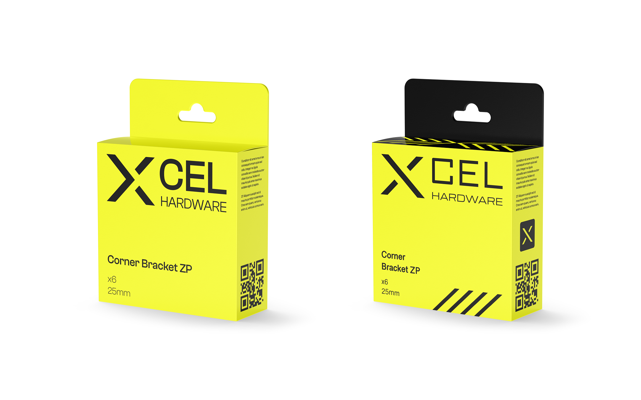
By stripping away unnecessary detail and creating a consistent visual language, the brand gains a clearer and more confident presence across the range. The result feels honest, accessible and dependable, helping Xcel stand out through clarity rather than noise and reinforcing its position as a straightforward, cost-effective choice.













More examples